Flame Journeys is a dynamic car branding project that ignites the road with vibrant designs and bold messaging. It transforms vehicles into mobile works of art, captivating audiences with its creative flair.

loading...
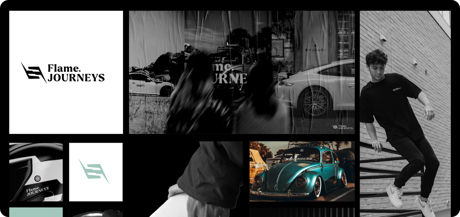
Flame Journeys is a dynamic car branding project that ignites the road with vibrant designs and bold messaging. It transforms vehicles into mobile works of art, captivating audiences with its creative flair.
The vision for "Flame Journeys" is to revolutionize car branding by creating eye-catching designs that turn vehicles into powerful, attention-grabbing marketing tools.
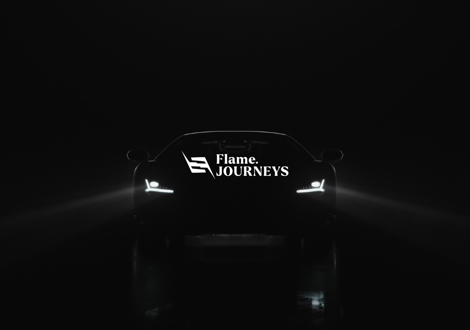
The behind story for car branding logo design often involves understanding the brand's identity, values, and target audience. Designers aim to create a logo that embodies the brand's essence and resonates with consumers, while also considering how it will be displayed on vehicles and other marketing materials. The process typically involves extensive research, brainstorming, and collaboration with the client to ensure the logo effectively represents the brand and its message. Ultimately,
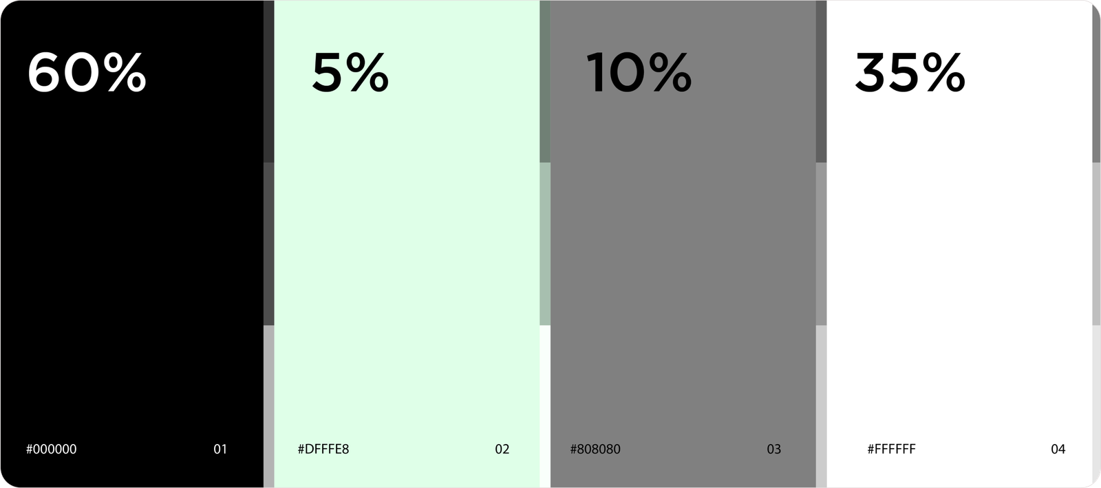
Light green evokes nature, growth, tranquility. Black signifies power, sophistication, and mystery. White represents purity, cleanliness, and simplicity. Gray symbolizes neutrality and balance.
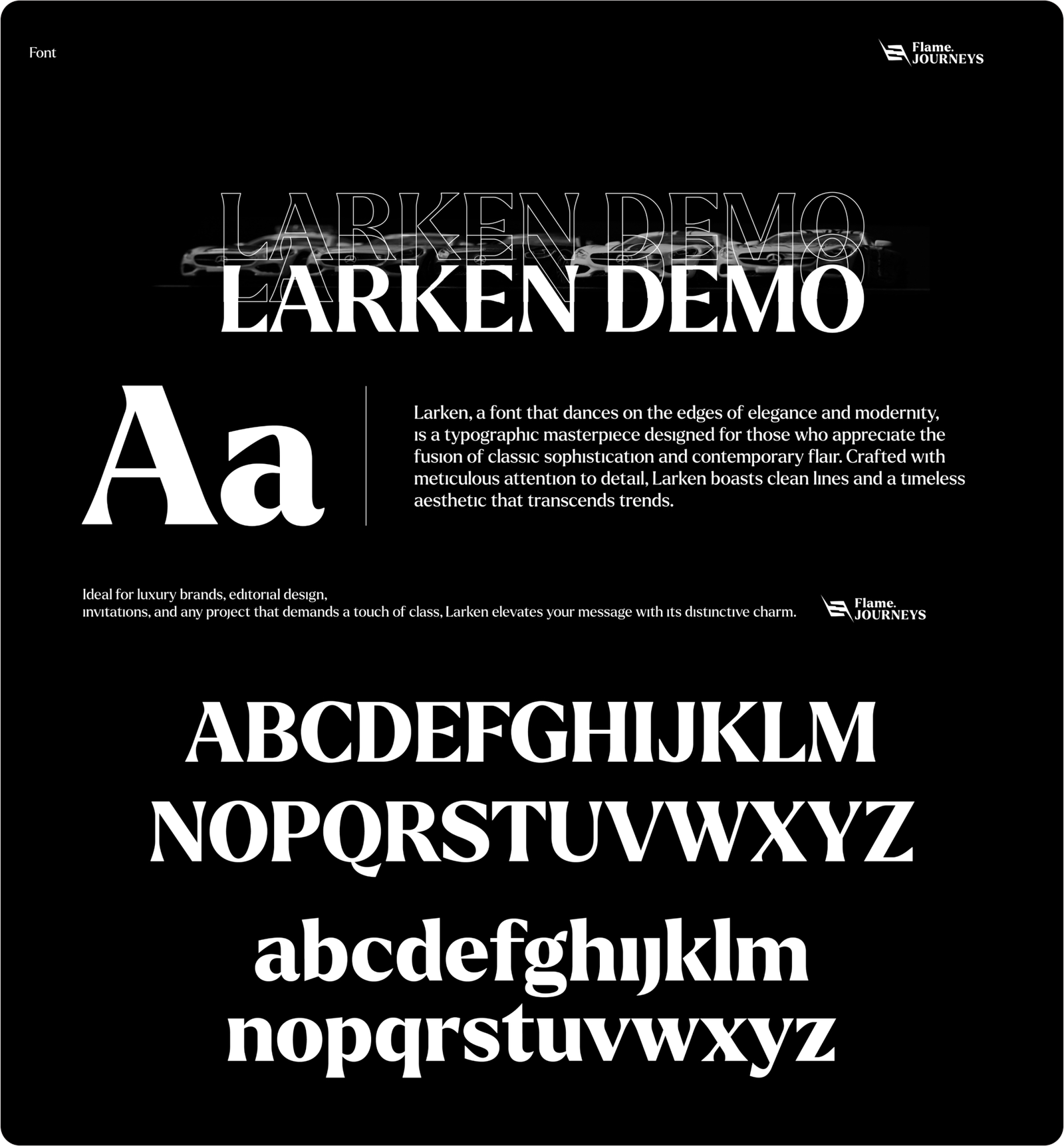
In the artful dance of letters, our chosen typography is the silent storyteller of our brand. Elegance meets functionality as every curve and space speaks volumes, ensuring a seamless and visually compelling communication experience.

shapes can convey specific meanings and evoke certain emotions. Different shapes have inherent associations, for example, circles can represent unity and wholeness, squares can convey stability and balance.

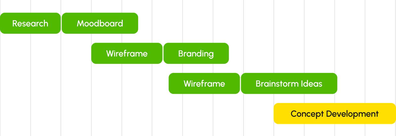
From concept inception to the final visual identity, each step is a deliberate stride toward crafting a brand that resonates with purpose and distinction.
